A portfolio should not feel like a wrapper
The new site is built around a simple idea: the interface should carry the same standards as the work it presents. If the work spans cinematography, AI production, websites, automation, and shipped systems, the site cannot just be a neat grid with a contact button at the end.
It has to behave like a piece of direction. It needs pacing, contrast, intentional transitions, and a sense that someone made choices frame by frame. That is the difference between a portfolio that lists credits and a portfolio that demonstrates taste.
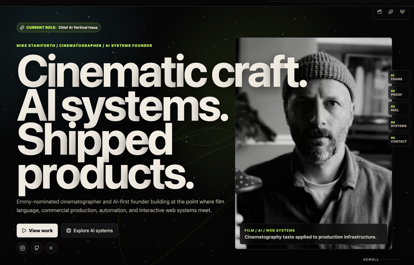
The homepage is a cinematic object
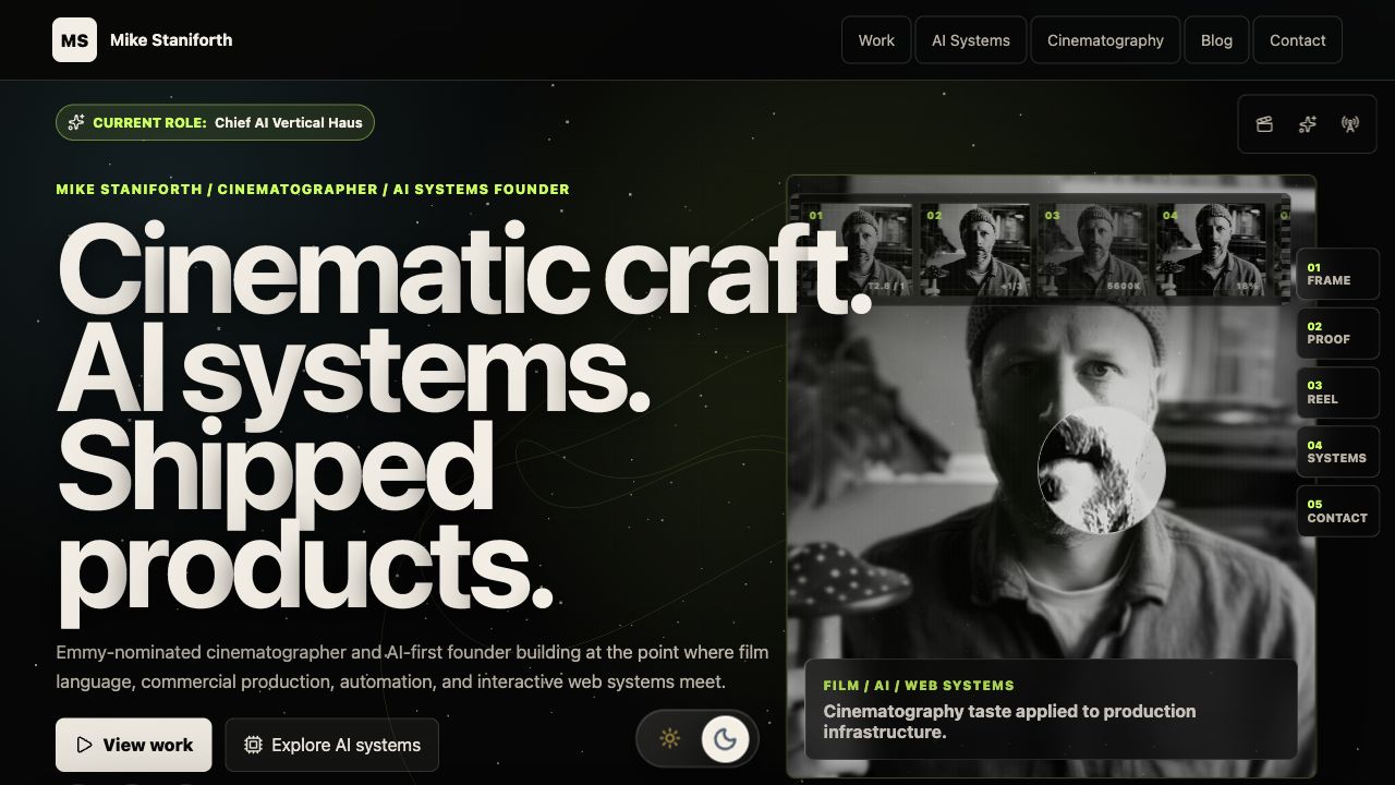
The hero is intentionally built around impact text. The typography is large, direct, and slightly confrontational because the first job of the page is not to explain everything. It is to establish a point of view: cinematic craft, AI systems, and shipped products belong in the same sentence.
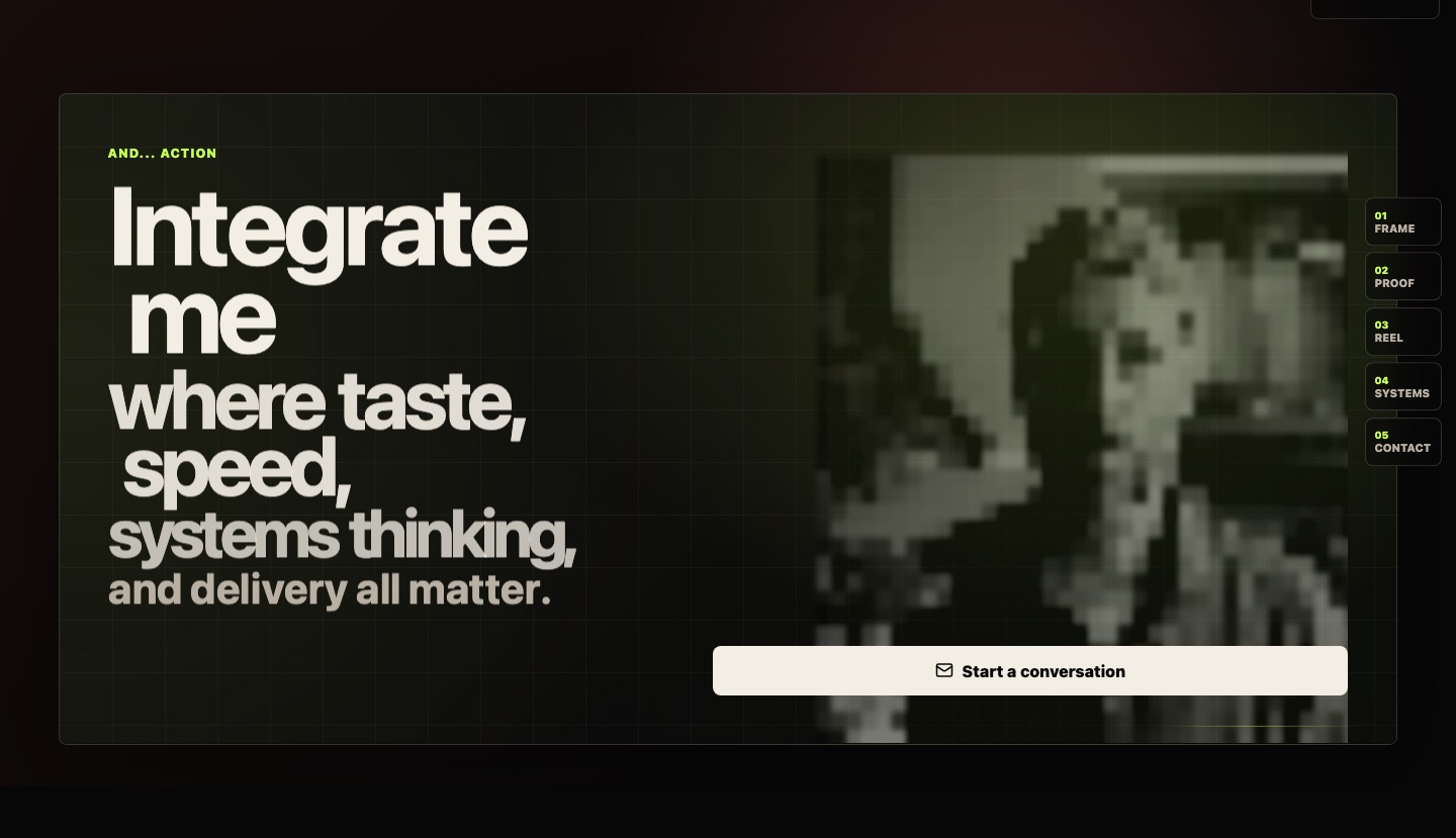
The portrait is treated as a living image system. At rest it remains human and photographic. Under the cursor it collapses into signal disruption, fragmented data, and a black-hole style distortion, as if the act of looking is interfering with the image itself. It is not there as a gimmick. It is a visual metaphor for the site: human craft meeting computational systems.
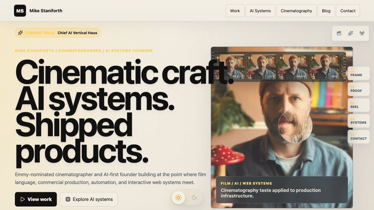
The light mode is a full art direction pass
The new light mode is not just the dark site inverted. It needed its own balance: warm paper tones, clear black typography, amber signals, softer panels, and enough contrast that the image-led sections still read properly in daylight.
That meant fixing the places where light mode exposed lazy assumptions. Text sitting over images needed explicit colour rules, quote panels needed dark surfaces again, and the interactive portrait effects had to reveal full colour rather than falling back to black and white underneath.
The scroll has to earn attention
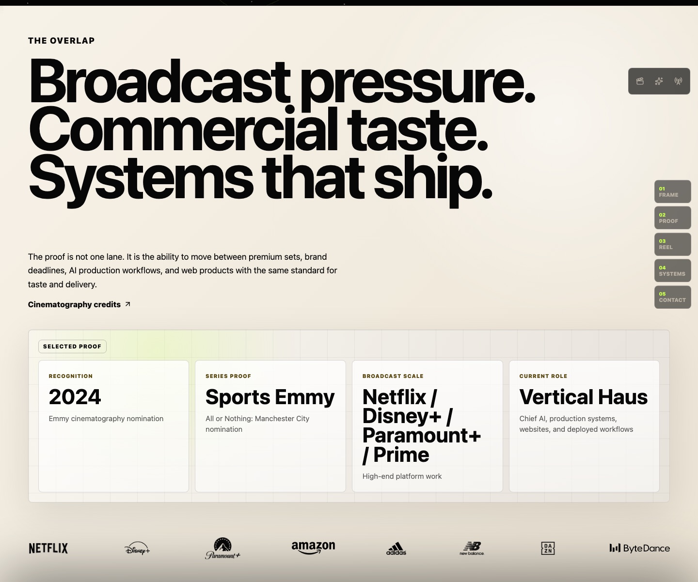
A good scroll experience is not just smooth movement. It is choreography. The sections on the homepage now have their own rhythm: a proof section with contrast and space, a selected work reel, AI systems cards, and a final CTA that changes the density of the text as the viewer moves through it.
That matters because scroll is the user’s edit. Every section should feel like a new beat, not another block of content. The motion is deliberately restrained: slower, more editorial, closer to a premium product page or an Awwwards-style portfolio than a generic startup animation kit.
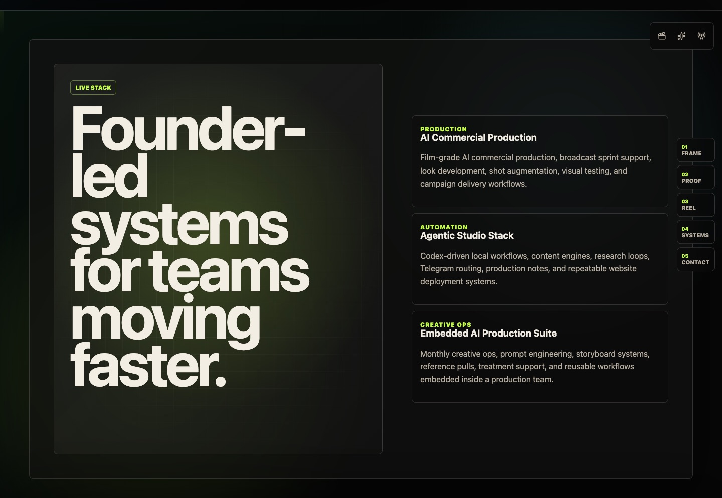
The AI work needed its own language
The AI Systems section is there because the Vertical Haus work is not just a side note. As Co-founder at Vertical Haus, the job is to build practical production infrastructure: AI commercial workflows, agentic studio loops, editorial content systems, Firebase-hosted web products, automation, and deployment patterns that survive contact with real work.
That is why the site separates cinematography proof from AI systems proof, then brings them back together. The same judgement that shapes a frame also shapes a stack: what to include, what to remove, when to automate, when to slow down, and how to keep the output feeling authored.
The little touches are not decoration
There are small interaction details throughout the site: the role marker, quick-access symbols, hover states, the light/dark theme toggle, a mobile drawer that blurs the page behind it, centered social icons, Open Graph preview cards, route-specific SEO, analytics, sitemap entries, and reduced-motion fallbacks.
Those details matter because premium work is cumulative. No single hover state makes the site feel finished. But each one removes friction, adds intent, or proves that the same care applied to the public image is also being applied underneath it.
There are also quieter personal signatures tucked into the motion language. They are not signposted, because not everything personal has to be announced. Some details are allowed to be found.
Why this version matters
This site is now more than a personal homepage. It is a working example of the kind of thing I want to build more of: cinematic web experiences that feel authored, technically sound, mobile-aware, SEO-ready, and connected to a real production workflow.
The point is not only to show what I have made. It is to make people feel, within a few seconds, that the site itself could only belong to someone who works across image-making, systems, and delivery.
Build
Need a repeatable AI production workflow?
Mike designs the tools, review loops, and publishing systems that make it usable.
Keep reading